Grid List
Grid lists display a collection of images in an organized grid.
Grid lists represent a collection of items in a repeated pattern. They help improve the visual comprehension of the content they hold.
Image-only Grid list
A simple example of a scrollable image GridList.
<GridList cellHeight={160} className={classes.gridList} cols={3}>
  {tileData.map(tile => (
    <GridListTile key={tile.img} cols={tile.cols || 1}>
      <img src={tile.img} alt={tile.title} />
    </GridListTile>
  ))}
</GridList>
Grid list with titlebars
This example demonstrates the use of the GridListTileBar to add an overlay to each GridListTile.
The overlay can accommodate a title, subtitle and secondary action - in this example an IconButton.
- December
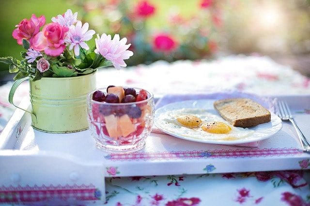 Breakfastby: jill111
 Tasty burgerby: director90
 Cameraby: Danson67
 Morningby: fancycrave1
 Hatsby: Hans
 Honeyby: fancycravel
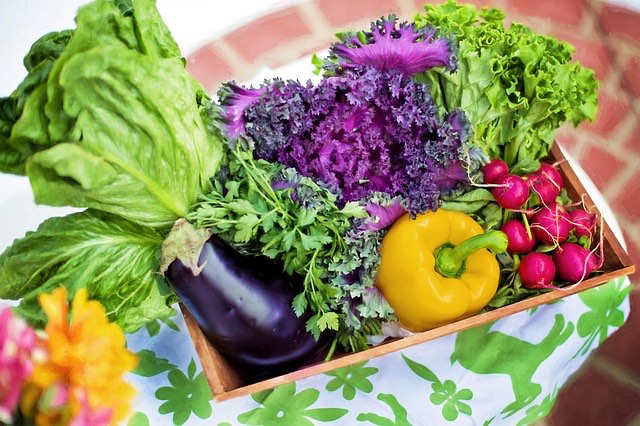 Vegetablesby: jill111
 Water plantby: BkrmadtyaKarki
 Mushroomsby: PublicDomainPictures
 Olive oilby: congerdesign
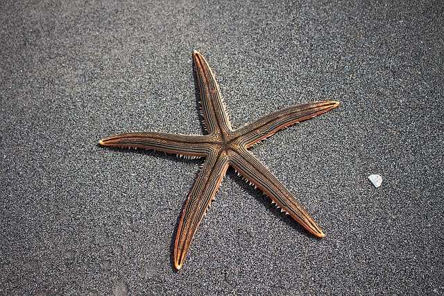 Sea starby: 821292
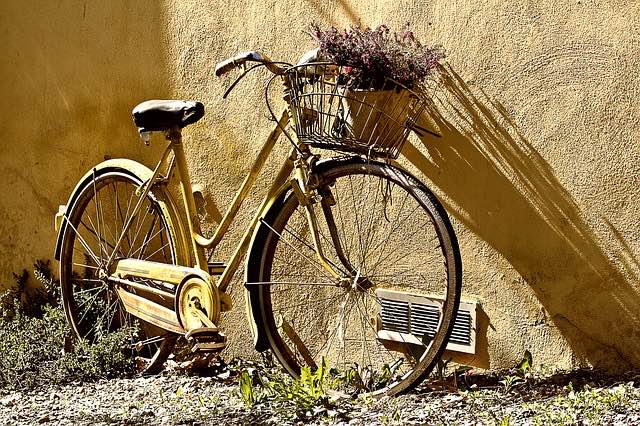 Bikeby: danfador
Single line Grid list
This example demonstrates a horizontal scrollable single-line grid list of images. Horizontally scrolling grid lists are discouraged because the scrolling interferes with typical reading patterns, affecting comprehension. One notable exception is a horizontally-scrolling, single-line grid list of images, such as a gallery.
 Breakfast
 Tasty burger
 Camera
 Morning
 Hats
Hats Honey
Honey Vegetables
 Water plant
 Mushrooms
 Olive oil
 Sea star
 Bike
Bike
Advanced Grid list
This example demonstrates "featured" tiles, using the rows and cols props to adjust the size of the tile, and the padding prop to adjust the spacing.
The tiles have a customized titlebar, positioned at the top and with a custom gradient titleBackground.
The secondary action IconButton is positioned on the left.
 Breakfast
 Tasty burger
 Camera
 Morning
 Hats
Hats Honey
Honey Vegetables
 Water plant
 Mushrooms
 Olive oil
 Sea star
 Bike
Bike